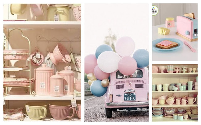
The Rose Serenity Sensation
How much pink and blue can this world afford this 2016 ? Because
the rose quartz and serenity ( a more tranquil blue) has being named the colors
of the year. And it seems true. The pastels have made their mark on the fashion
rampart while taking the interior décor by awe. Maybe it spreads even beyond in order to give a first-hand experience of
this “Ladure” pantone versions in every
statement restaurant and boutique store. It’s the first time that the pantone
color of the year is a blend of two most soft colors the pallet has to offer. Rose Quartz is a persuasive yet gentle tone that conveys
compassion and a sense of composure. Serenity is weightless and airy, like the
expanse of the blue sky above us, bringing feelings of respite and relaxation
even in turbulent times.
The stress and hassle we go through in our complex day-to-day
lives have compelled us to seek peace and tranquility. Thus welcoming colors
which reflect a cool and serene mindset creates a psychological harmony which
results from the inherent balance between the warmer embracing rose tone and cooler
blue. The combination demonstrates the connection and wellness with a
soothing sense of order and peace in our daily lives. The shades calm and
comfort our senses and signify health and wellness.
On a further note the quarts rose and serenity has always
being adjudged the gender colors which have stood on either sides of the
rampart. However, this tradition is being challenged and replaced with equality
across diverse cultures and races. Thus the combination itself and PANTONE
settling for a combination for the year, reflects more acceptance for the
concept of gender fluidity.
Equally, it gives consumers an opportunity to express and
exchange their individuality through their usage of color, whether in soft or
hard surface material, the pairing of Rose Quartz and Serenity brings about
calm and unwinding sense. Appealing in all finishes, matte, metallic and
glossy, the engaging combo joins easily with other mid-tones including greens
and purples, rich browns, and all shades of yellow and pink. Add in silver or
hot brights for more splash and sparkle.
The pantone color is the perfect re-incarnation of retro
lifestyle – reminds of the jars, jugs and mugs that ensemble grand ma’s
tabletop, baby showers, and even pink cars.
The colors also takes us on a tour of the vintage warmth you
experience at a cozy restaurant in Paris.
So, how exactly can we translate these colorful self-expressions
in to our daily fashion statements ? As I was analyzing the diverse
combinations where the two colors could be fused together, the contexts looked
seamless. And the tones have inspired the trends in interior décor, tableware,
apparel and even food.
The trend has made its way in to interior décor in a
significant manner by toning down the bright magentas and bohemian accents down
to a more subtle romance. Thus the households reflect a more soothing summery
air with a cooler ambiance. The amalgamation of pastel shades adds elegance and
sophistication to the shabby-chic living.


No comments:
Post a Comment