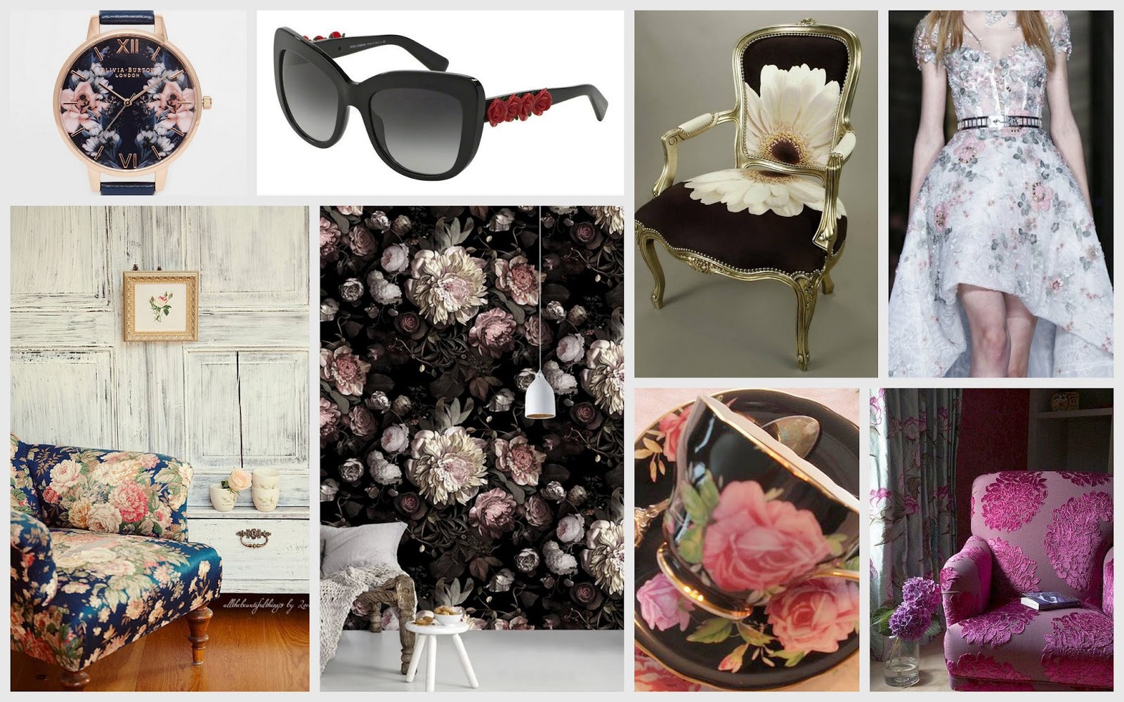
Thursday, August 25, 2016

The Flower Shower


Since the inception of civilization, flowers have been the most celebrated fashion icon. Printed and embossed unto garments, wall papers, furniture and tableware, not only does it brings us close to nature, but to the most adorned element of it - delicate, romantic blossoms of love and the gift of spring. Set on diverse backdrops with an assortment of form, the floral accents adore 16/17 across all seasons.


Apparel and fashion accessories are perhaps the fastest to capture this diverging trends in floral inspirations and produce timeless masterpieces.


The pastel hues with water color effect cocoons the warmth and reflects upon the shine of Spring Summer times. The undefined edges of the floral patterns which subtly blend with clear, well lit backgrounds create the perfect match on any surface. The trend is towards individual full blooms and buds that mingle with twigs and wreaths of green that stand out of the heavy foliage.


The old retro and vintage designs have also made a come back during the season. 
Vintage style floral designs against clean cut backdrops on sofas, upholstery and tableware re-create the perfect coziness blended with luxury living of a bygone era.


The contemporary floral themes are a manifestation of summery flair with pastel shades on one end. On the other end, the spring air is embraced by brighter and bolder colors with abstract floral illustrations.


Against dark backdrops, the blooms illuminate the contrast among bright hues. Thus unfolds the romance of darkness and frost.


Thursday, June 16, 2016

Urban Rainforest


Urban Rain forest


Yes.. the leaves, trees and the whole tropical ambiance is making its way indoors creating the woods within our hectic lives. Not only does this concept calms our busy lifestyle, it also stimulates our senses and inspire creativity. Though the trend had never been out of fashion, a more upstyle trend of amalgamating the thick foliage in large print is in fashion than never before.


Let it be sofas, cushions, rugs, lamps, wall papers or photo frames, the nature could have the highest influence on prints. It lights up the living spaces with colors, shapes and patterns of tropical soil.


In the fashion industry, the shades of tropical leafy greens and bold sunlit blooms dominate casual and holiday wear taste. The pallet is so rich that it includes almost every shade of green and brown. Soft silk material gives vibrance to these bold prints and radiates a more youthful appeal. It’s as if the sun has suddenly shown its brighter face to the whole of earth inspiring our outlook towards life with its light and warmth.


The natural subjects also inspire pattern and form in accessories to complete this whole tropical extravagance.


The palm, banana and taro leaves are the perfect embodiment of tropical exquisity.


What makes the trend even more unique is how the greens could actually be brought home in containers, hanging pots or ramshackle structures. This unique urban tree house experience creates the ultimate refuge indoors, out in the terrace or balcony. The pots themselves reflect the unique individuality and aesthetic by the use of materials such as stone-ware, wood, porcelain, glass, terra-cotta, seashells, concrete and even specialized paper. Nylon and forms of metal have replaced knotted sisal and natural hanging material. In potted plants succulants and cacti takes a center stage this season for its convenience in handling and maintenance.The fusion of these plants create the ideal “green wall” inside the living spaces.


Wednesday, June 1, 2016

The Rose Serenity Sensation


The Rose Serenity Sensation


How much pink and blue can this world afford this 2016 ? Because the rose quartz and serenity ( a more tranquil blue) has being named the colors of the year. And it seems true. The pastels have made their mark on the fashion rampart while taking the interior décor by awe. Maybe it spreads even beyond  in order to give a first-hand experience of this “Ladure” pantone versions  in every statement restaurant and boutique store. It’s the first time that the pantone color of the year is a blend of two most soft colors the pallet has to offer. Rose Quartz is a persuasive yet gentle tone that conveys compassion and a sense of composure. Serenity is weightless and airy, like the expanse of the blue sky above us, bringing feelings of respite and relaxation even in turbulent times.


The stress and hassle we go through in our complex day-to-day lives have compelled us to seek peace and tranquility. Thus welcoming colors which reflect a cool and serene mindset creates a psychological harmony which results from the inherent balance between the warmer embracing rose tone and cooler blue. The combination demonstrates the connection and wellness with a soothing sense of order and peace in our daily lives. The shades calm and comfort our senses and signify health and wellness.

On a further note the quarts rose and serenity has always being adjudged the gender colors which have stood on either sides of the rampart. However, this tradition is being challenged and replaced with equality across diverse cultures and races. Thus the combination itself and PANTONE settling for a combination for the year, reflects more acceptance for the concept of gender fluidity.


Equally, it gives consumers an opportunity to express and exchange their individuality through their usage of color, whether in soft or hard surface material, the pairing of Rose Quartz and Serenity brings about calm and unwinding sense. Appealing in all finishes, matte, metallic and glossy, the engaging combo joins easily with other mid-tones including greens and purples, rich browns, and all shades of yellow and pink. Add in silver or hot brights for more splash and sparkle.


The pantone color is the perfect re-incarnation of retro lifestyle – reminds of the jars, jugs and mugs that ensemble grand ma’s tabletop, baby showers, and even pink cars.

The colors also takes us on a tour of the vintage warmth you experience at a cozy restaurant in Paris.


So, how exactly can we translate these colorful self-expressions in to our daily fashion statements ? As I was analyzing the diverse combinations where the two colors could be fused together, the contexts looked seamless. And the tones have inspired the trends in interior décor, tableware, apparel and even food.


The trend has made its way in to interior décor in a significant manner by toning down the bright magentas and bohemian accents down to a more subtle romance. Thus the households reflect a more soothing summery air with a cooler ambiance. The amalgamation of pastel shades adds elegance and sophistication to the shabby-chic living.